Get Start With MyStyle
MS Framework (MyStyle) is a lightweight, utility-first CSS framework designed to simplify web development with clean, responsive styles. It focuses on speed, ease of use, and customization — ideal for both beginners and rapid prototyping.
First Step
Create a new HTML file In your Root Directory/Folder (Project Folder)
Second Step
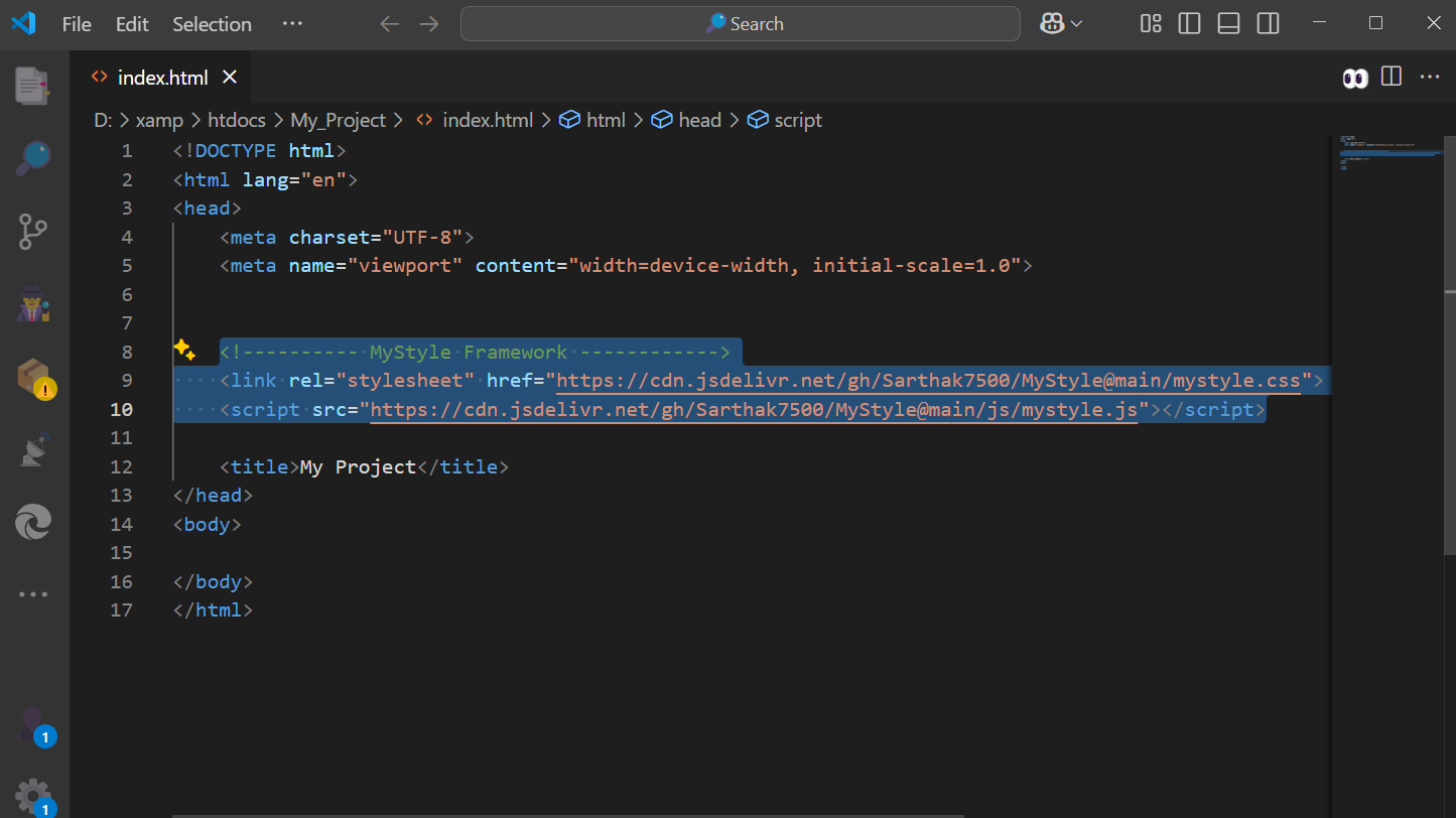
Copy the code below and paste it between <head></head> (Head Tag) of your HTML file
<!-------------MyStyle FRAMEWORK------------>
 <link rel="stylesheet" href="https://cdn.jsdelivr.net/gh/Sarthak7500/MyStyle@main/mystyle.css">
            <script src="https://cdn.jsdelivr.net/gh/Sarthak7500/MyStyle@main/js/mystyle.js"></script>
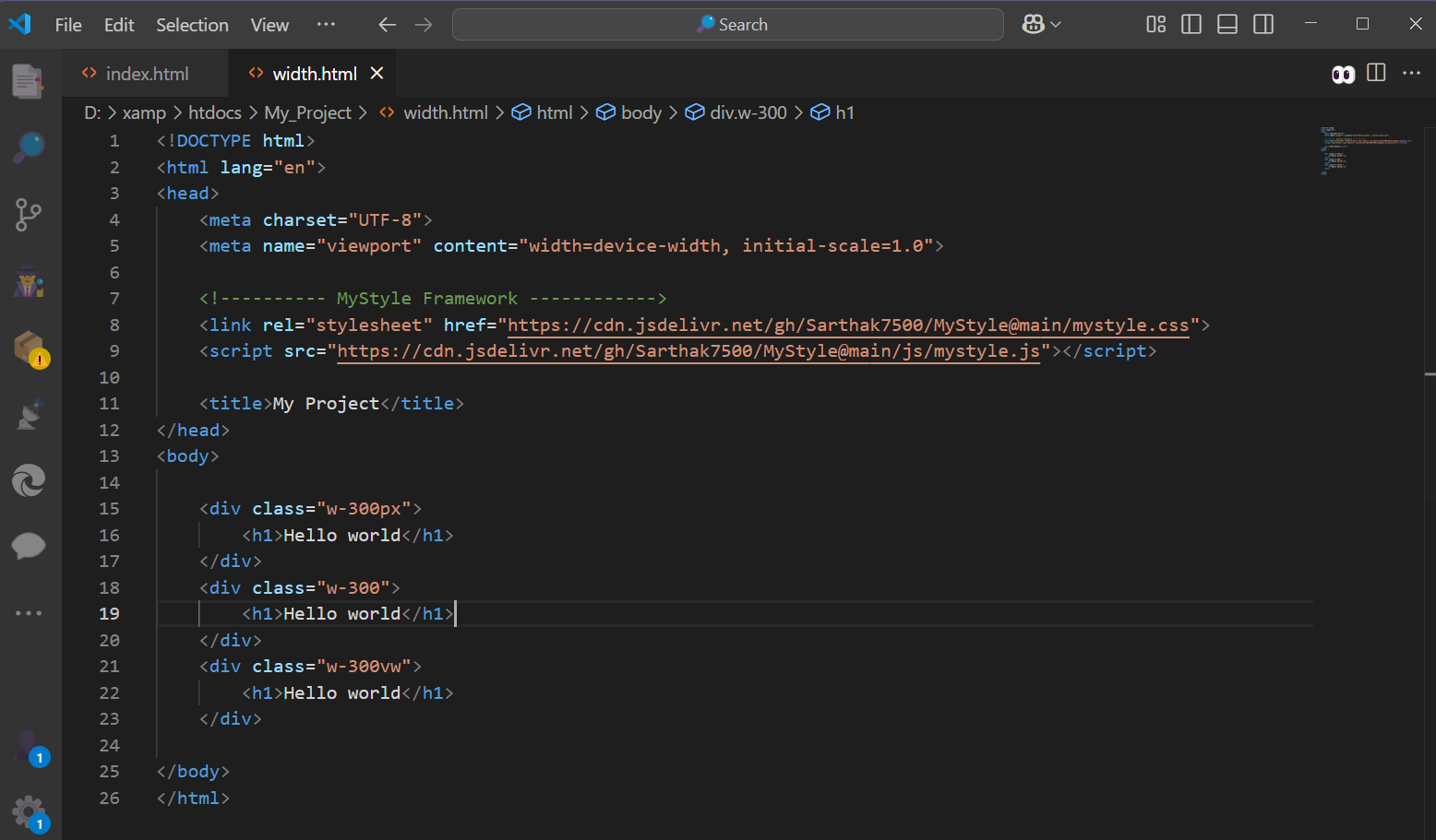
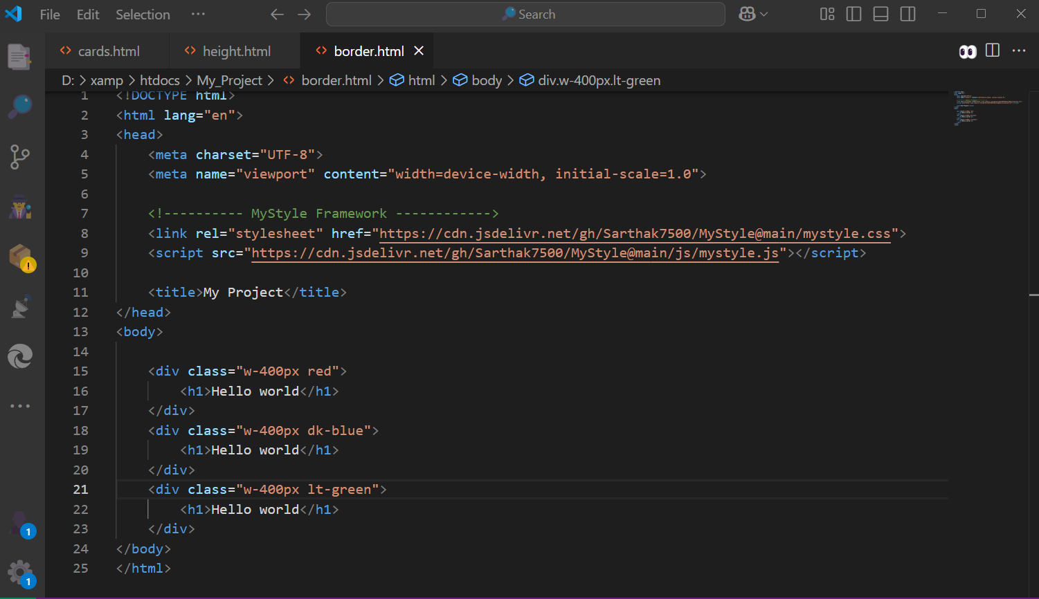
Width
MyStyle Framework provides a range of width utility classes using the .w-* format,
allowing you to control the width of elements with ease. These classes include:
Widths By Percentage (%): .w-25, .w-50, .w-75, .w-100 for 25%, 50%, 75%, 100%, etc
Widths By Pixels (px): .w-10px, .w-50px, .w-100px, .w-200px for 10px, 50px, 15px, 300px, etc.
Widths By Virtual Width (vw): .w-10vw, .w-20vw, .w-50vw, .w-100vw for 10vw, 20vw, 50vw, 100vw, etc.
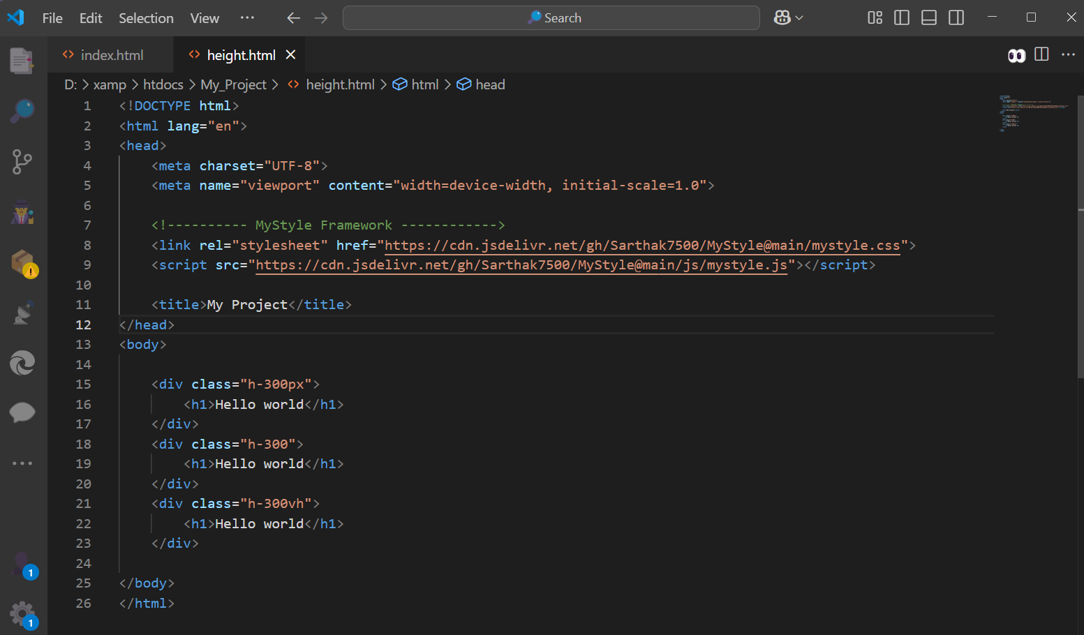
Height
MyStyle Framework provides a range of Height utility classes using the .h-* format,
allowing you to control the Height of elements with ease. These classes include:
Heights By Percentage (%): .h-25, .h-50, .h-75, .h-100 for 25%, 50%, 75%, 100%, etc
Heights By Pixels (px): .h-10px, .h-50px, .h-100px, .h-200px for 10px, 50px, 15px, 300px, etc.
Heights By Virtual Height (vh): .h-10vh, .h-20vh, .h-50vh, .h-100vh for 10vh, 20vh, 50vh, 100vh, etc.
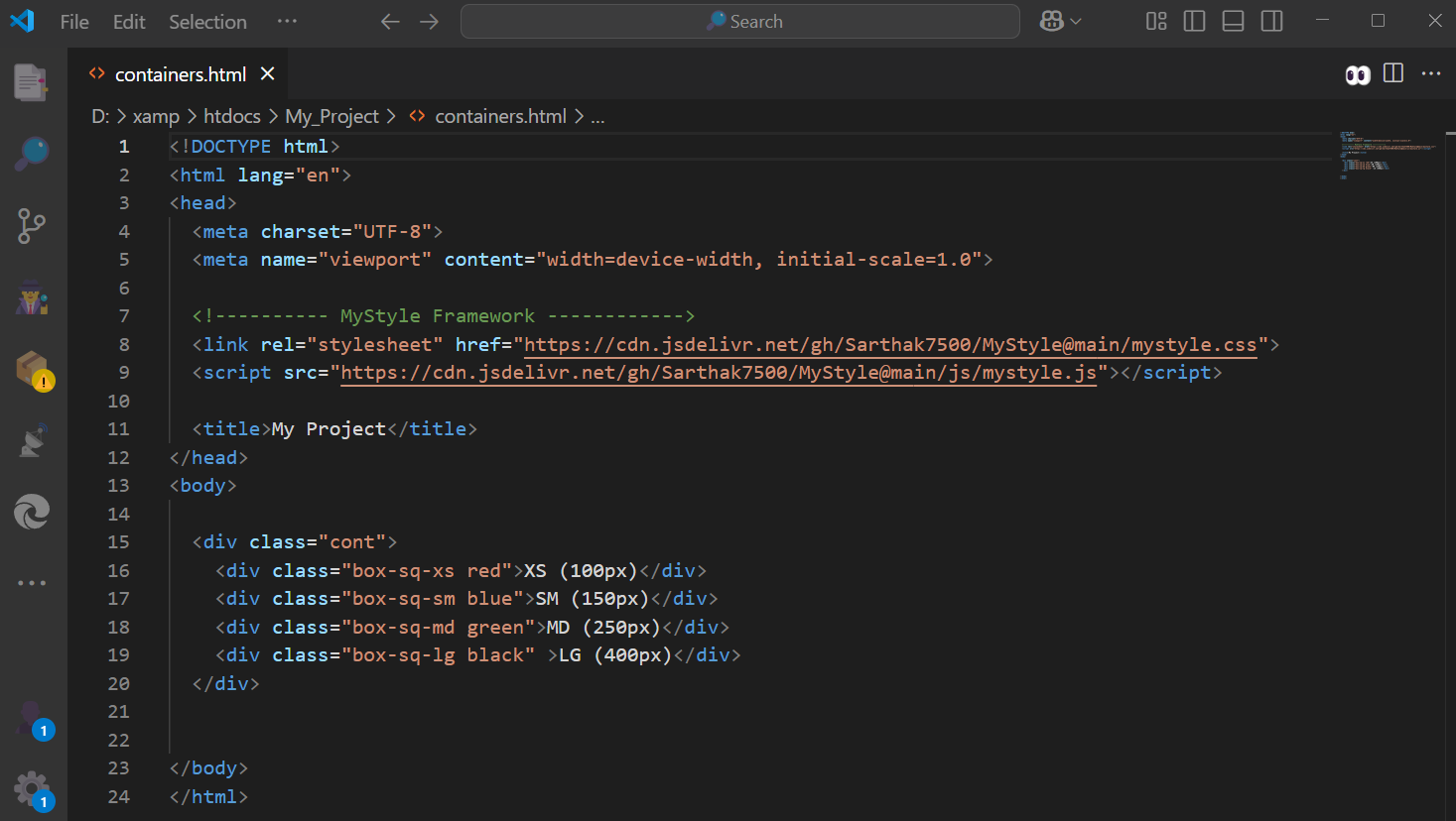
Containers
MyStyle Framework includes container and boxes utility classes to help structure your layouts:
✅ Available Container Classes
- .cont: Full-width container with zero padding/margin — acts as a base wrapper.
- .box: A centered content block with 70% width and generous padding.
- .box-sq-xs .box-sq-sm .box-sq-md .box-sq-lg: Square box variations from 100px to 400px wide — ideal for cards, banners.
- .cont-rd: Adds 30px border-radius with top and bottom margins — great for curved section blocks.
- .cont-left .cont-right: 45% width floating containers for side-by-side layouts.
- .cont-txt-left .cont-txt-right: 50% split full-height containers — perfect for hero sections or dual-column layouts.
More Class Reference
| Class | Purpose |
|---|---|
| .rd-1 | Applies border-radius: 8px to the video element. |
| .rd-2 | Applies border-radius: 15px to the video element. |
| .rd-3 | Applies border-radius: 20px to the video element. |
| .rd-4 | Applies border-radius: 30px to the video element. |
| .circle | Applies border-radius: 50% to make the video circular. |
| .rotate-30 | Rotate any object to the left by 30 degrees using transform: rotate(-30deg); You can use it for angles like: 30, 45, 60, 90, 180, 270, 360 |
| .player | For adding HTML 5 video, Use it in a div in which you want to add video. |
| .player-lay | used to create a dark overlay layer on top of a video or image, often for adding text or dimming the background for better readability |
| .img-collage | used to create a responsive image grid layout using CSS Grid |
| .player-lay-txt | used in h or p tag to center content (like text or icons) over the video, |
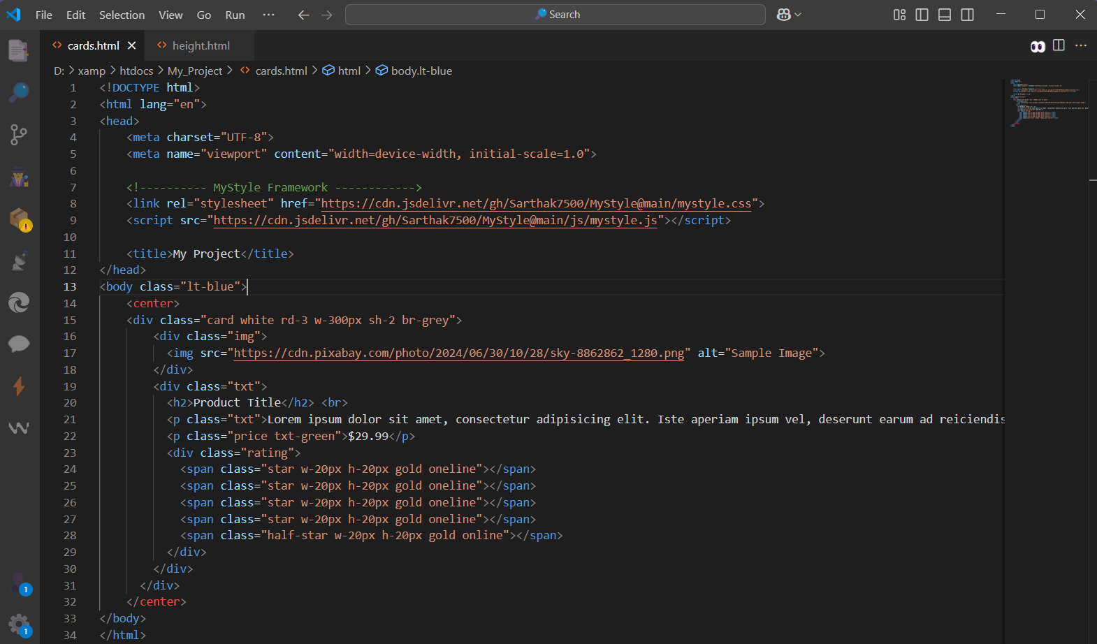
How to Use Cards
The .card CSS defines a flexible layout for product or content cards, supporting both stacked and split (image-text) designs. It ensures responsive images, styled text, pricing, and optional star ratings with smooth transitions.
| Selector | Description / Purpose |
|---|---|
| .card | Main container for the card, displayed inline-block with a smooth transition effect (0.4s). |
| .card .img | Wrapper for the image, takes full width and auto height, no margin. |
| .card .img img | Ensures the image fills the container’s width and keeps its aspect ratio. |
| .card .txt | Text section of the card with 20px padding on top and bottom. |
| .card .price | Styles the price text with a readable font size of 18px. |
| .rating .star | Displays individual full stars for ratings inline. |
| .rating .half-star | Displays half-star icons inline for ratings. |
| .card .left-img | Used for a card layout where the image is on the left (50% width, floated left, vertically aligned top). |
| .card .right-txt | Text section placed on the right side (47% width), aligns vertically with the image using top and bottom margins. |
Display
The display property in CSS determines how an element is rendered in the layout flow of the document. Common values include:
| Class | CSS Rule(s) | Purpose |
|---|---|---|
| .block | display: block; | Forces the element to be block-level (full width). |
| .inline | display: inline; | Makes the element behave like inline (flows with text). |
| .inline-block | display: inline-block; vertical-align: top; | Like inline, but allows width/height; aligns top. |
| .flex | display: flex; | Enables Flexbox layout. |
| .inline-flex | display: inline-flex; | Flexbox layout that flows inline. |
| .grid | display: grid; | Enables CSS Grid layout. |
| .inline-grid | display: inline-grid; | Grid layout that flows inline. |
| .none | display: none !important; | Hides the element entirely. |
| .oneline | display: inline-block; | Keeps element inline with ability to set size (similar to .inline-block). |
| .fixed / .fx | position: fixed; | Fixes the element relative to the viewport. |
| .relative | position: relative; | Positions the element relative to its normal position. |
| .absolute | position: absolute; | Positions element relative to the nearest positioned ancestor. |
| .fx-top-left | position: fixed; left: 0px; top: 0px; | Fixes element to top-left corner. |
| .fx-top-right | position: fixed; right: 0px; top: 0px; | Fixes element to top-right corner. |
| .fx-btm-left | position: fixed; left: 0px; bottom: 0px; | Fixes element to bottom-left corner. |
| .fx-btm-right | position: fixed; right: 0px; bottom: 0px; | Fixes element to bottom-right corner. |
| .vt | vertical-align: top; | Aligns inline/inline-block elements to the top. |
| .overx-scroll | overflow-x: scroll; | Enables horizontal scrolling. |
| .overx-auto | overflow-x: auto; | Enables horizontal scrolling if content overflows. |
| .overy-auto | overflow-y: auto; | Enables vertical scrolling if content overflows. |
| .overy-scroll | overflow-y: scroll; | Forces vertical scrolling regardless of content. |
| .overx-hidden | overflow-x: hidden; | Hides horizontal overflow content. |
| .overy-hidden | overflow-y: hidden; | Hides vertical overflow content. |
| .none (Visibility) | display: none !important; | Hides the element completely. |
| .visible | display: inline-block !important; | Displays the element as inline-block. |
| .hidden | visibility: hidden !important; | Hides the element, but it still takes up space in the layout. |
| .partial | opacity: 0.5; | Sets the element's opacity to 50% (semi-transparent). |
Grid System
The grid display in CSS is a powerful layout system that allows you to create complex designs with ease. It works by dividing a container into rows and columns, enabling you to place child elements precisely within these cells.
| Category | Class | Description |
|---|---|---|
| Core: Flexrow | .row | Sets the container as a flexbox with wrapping and negative margins for spacing. |
| Basic Columns | .col | Flex value set to 110%, width set to 100%. |
| Basic Columns | .col-auto | Flex set to 0 auto, width set to auto. |
| Fixed Columns | .col-1 | Width set to 8.333%. |
| Fixed Columns | .col-2 | Width set to 16.666%. |
| Responsive Breakpoints | .col-sm-6 | For screen width ≥576px, width set to 50%. |
| Responsive Breakpoints | .col-sm-4 | For screen width ≥576px, width set to 33.333%. |
| Responsive Breakpoints | .col-md-6 | For screen width ≥768px, width set to 50%. |
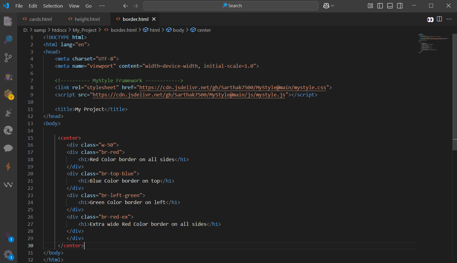
Borders
MyStyle Framework provides a range of border utility classes to help you style elements easily. These classes include:
- .br-red: Add border on all side, You choose from various color option red, blue, etc.
- .br-top-red: Add border on top side, You choose from various color option red, blue, etc.
- .br-bottom-red: Add border on bottom side, You choose from various color option red, blue, etc.
- .br-left-red: Add border on left side, You choose from various color option red, blue, etc.
- br-right-red: Add border on right side, You choose from various color option red, blue, etc.
- .br-red-ex : Add extra border on all side, You choose from various color option red, blue, etc.
Backgrounds
MyStyle Framework provides a range of background utility classes to help you style elements easily. These classes include:
Background color by Name: .green .red .blue, etc
Dark Version of color: .dk-blue .dk-red .dk-green, etc
Light Version of color: .lt-blue .lt-red .lt-green, etc
Neon Version of color: .neon-blue .neon-red .neon-green, etc,
Opacity: .op-1opacity: 0.2 .op-2 opacity: 0.4 .op-3 opacity: 0.6 .op-4 opacity: 0.8
Blur Background: .blur-1 blur(2px) .blur-2 blur(5px) .blur-3 blur(10px)
More Background Classes
| Class Name | Description |
|---|---|
| .trans | Applies a semi-transparent white background using rgba(255,255,255,0.4). |
| .glass | Applies a soft light-blue/white background color #f6ffff, giving a mild glass look. |
| .tr-black | Applies a semi-transparent black background using rgba(0,0,0,0.4). |
| .tr-white | Applies a semi-transparent white background using rgba(255,255,255,0.4). |
| .bg-cover | Sets background image to cover the entire element with background-size: cover and no repeat. |
| .bg-fit | Ensures media or background fits the container with object-fit: cover and background-size: cover. |
| .bg-fixed | Fixes the background image during scroll using background-attachment: fixed. |
Fonts
MyStyle Framework provides a range of font utility classes to help you style text easily. These classes include:
- Fonts Color: .txt-red .txt green .txt-dk-blue, etc.
Use any color by just adding ".txt-" before color name - Font-Size: f20 f40 f60,etc. Write F and then write the font-size in px (but only in even numbers)
for eg: 2, 4, 6, 8, 10, 12 , 14, 20,.... etc. You can read fonts.css for more info about font sizes.
More Font Classes:
| Class | Description | Effect (Example) |
|---|---|---|
| .txt-center | Aligns text to the center | Centered Text |
| .txt-left | Aligns text to the left | Left Aligned Text |
| .txt-right | Aligns text to the right | Right Aligned Text |
| .txt-justify | Justifies the text | This is an example of justified text that adjusts spacing. |
| .bold | Makes text bold | Bold Text |
| .italic | Makes text italic | Italic Text |
| .underline | Underlines text | Underlined Text |
| .upper | Transforms text to UPPERCASE | uppercase text |
| .lower | Transforms text to lowercase | LOWERCASE TEXT |
| .capital | Capitalizes each word | capitalize each word |
Font Family
MyStyle Framework have an In Build Integration with Google Fonts, MyStyle Framework provides a range of font family utility classes to help you style elements easily. You don't need to add Google Fonts link in your HTML. if you are using fonts from MyStyle Framework, Just Directly use our font family classes. These classes include:
MS Framework Font Family Classes
| Class | Description | Sample Output |
|---|---|---|
| .f-monospace | Monospace font | The quick brown fox |
| .f-comfortaa | Comfortaa font | The quick brown fox |
| .f-lobster | Lobster font | The quick brown fox |
| .f-afacad-flux | Afacad Flux font | The quick brown fox |
| .f-kablammo | Kablammo font | The quick brown fox |
| .f-rubik-vinyl | Rubik Vinyl font | The quick brown fox |
| .f-ubuntu | Ubuntu font | The quick brown fox |
| .f-boldonse | Boldonse font | The quick brown fox |
| .f-caveat | Caveat font | The quick brown fox |
| .f-darumadrop-one | Darumadrop One font | The quick brown fox |
| .f-finger-paint | Finger Paint font | The quick brown fox |
| .f-macondo | Macondo font | The quick brown fox |
| .f-orbitron | Orbitron font | The quick brown fox |
| .f-allura | Allura font | The quick brown fox |
| .f-bebas-neue | Bebas Neue font | The quick brown fox |
| .f-carter-one | Carter One font | The quick brown fox |
| .f-cookie | Cookie font | The quick brown fox |
| .f-lilita-one | Lilita One font | The quick brown fox |